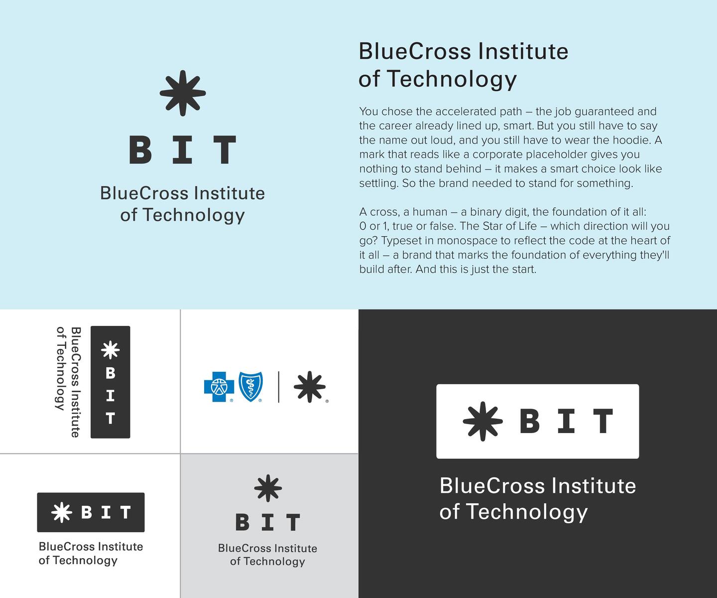
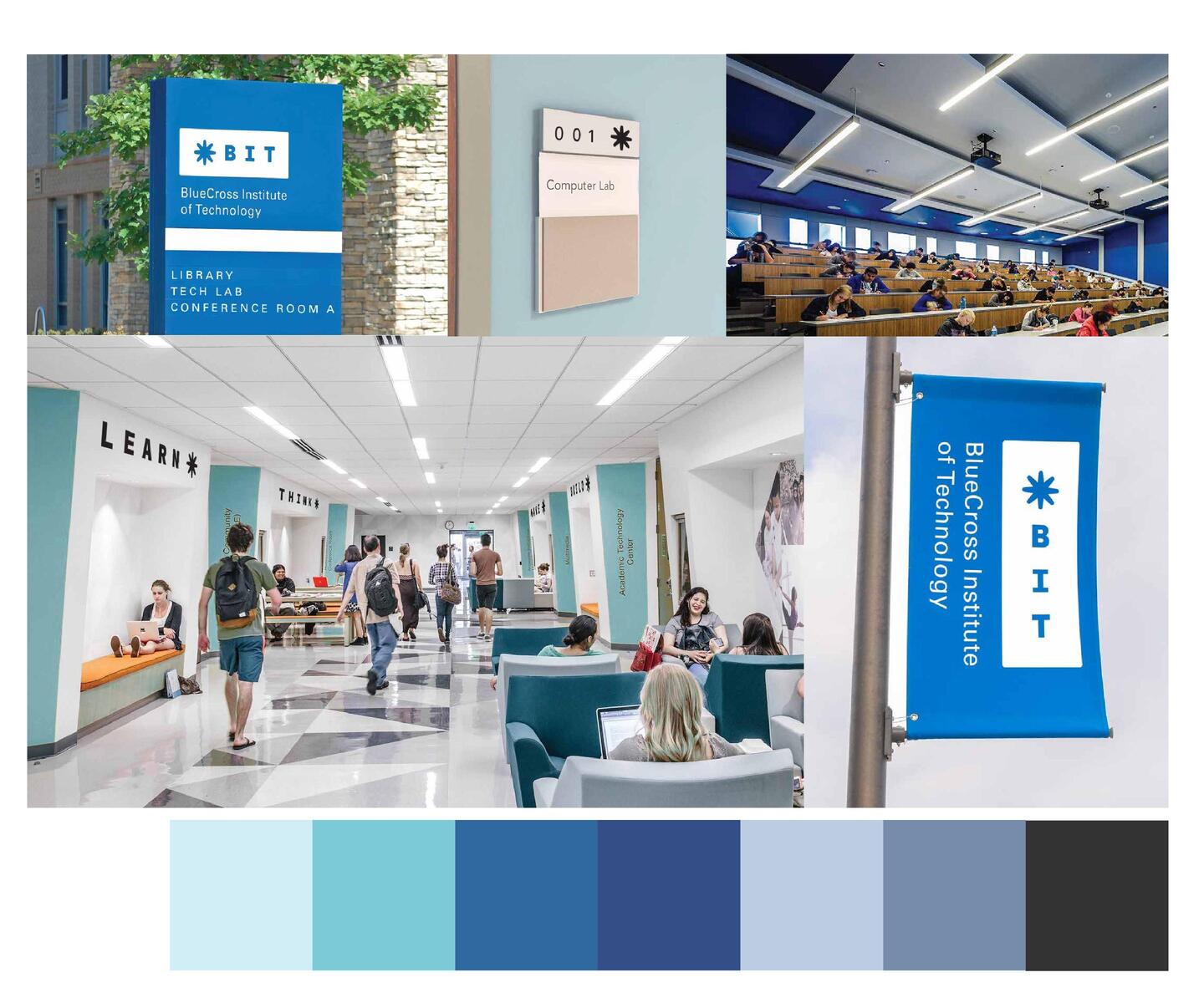
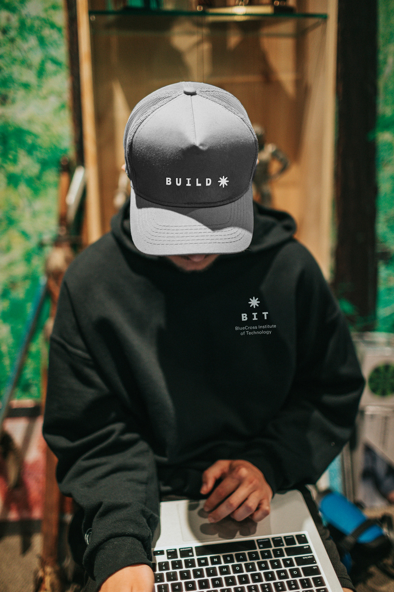
Brand identity for BCBST's first education-to-employment pipeline.
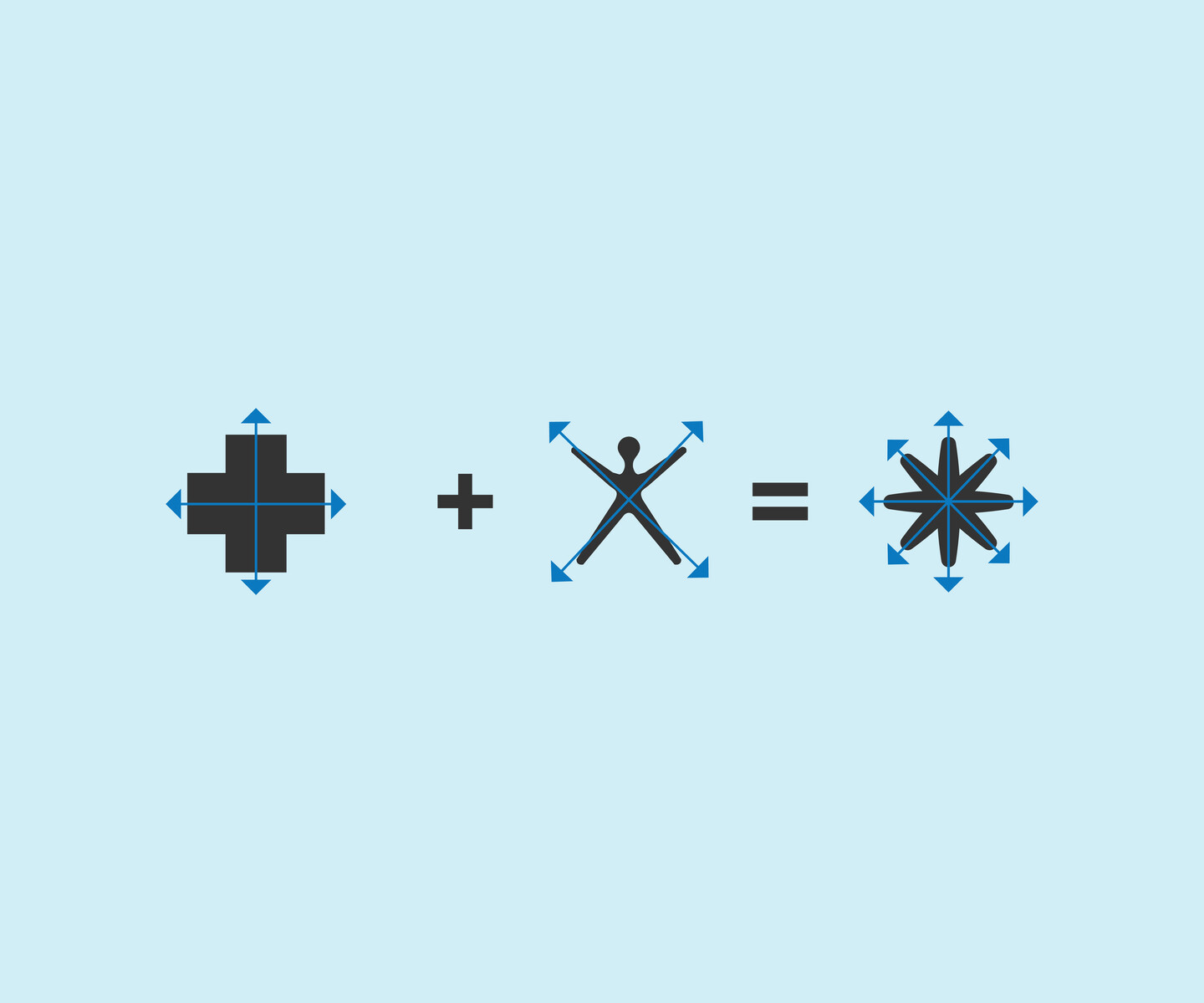
The name already had meaning in it – a bit, the binary digit at the foundation of everything these students would build. The mark had to find that and make it visible. A cross and the Vitruvian man overlaid produce the asterisk: the unit, the Star of Life, the wildcard. Three readings, one symbol.
Problem Statement: A brand for students who chose the accelerated path – job guaranteed, career open. The credential had to hold up when they said the name out loud, when they handed over the resume, when they walked out in the hoodie. A mark that read like a placeholder would make a smart choice look like settling.
Successes: The asterisk came from what was already there. The cross, the human figure, the healthcare lineage, the code environment – none of it invented. All of it found.
Category: Brand
Client: BlueCross BlueShield of Tennessee