


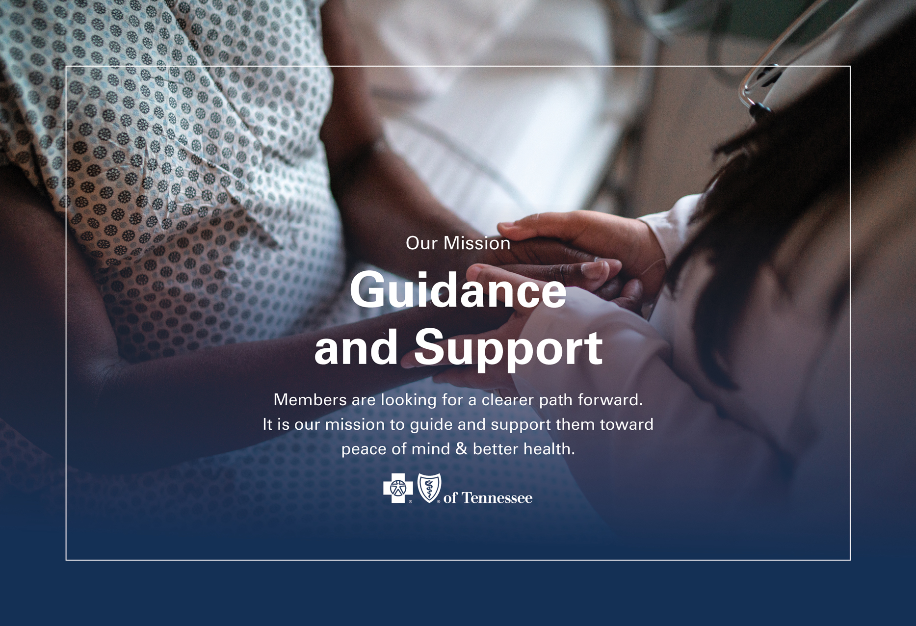


The Process
Six phases – discover, define, ideate, create, test, develop – research through delivery, with engineering at the table from day one. No inherited system, no established language. Everything built from scratch at enterprise scale.
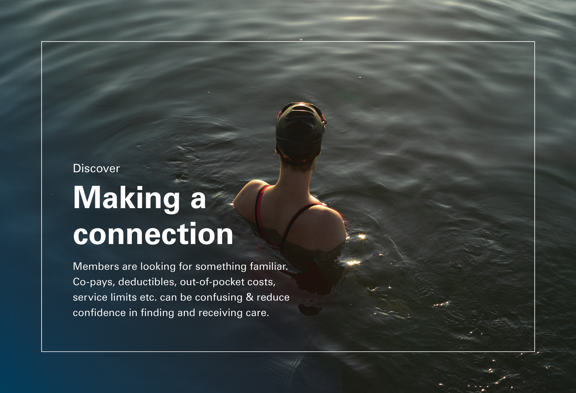
Discover
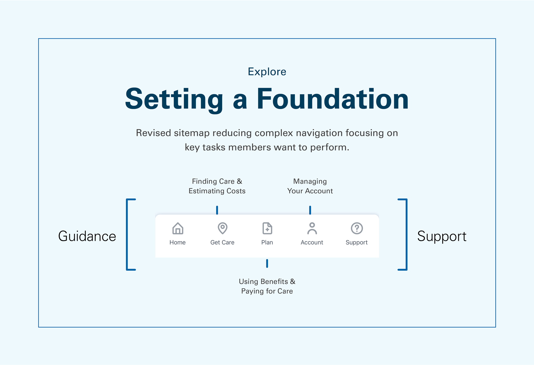
The app hadn’t been touched since 2016. Five years of accumulated friction – members navigating something built for a different era of expectation. Before anything got designed, the UX research team ran a full round of stakeholder workshops and moderated user interviews, mapping where the experience broke down and what a better one might need to do. Over 20 studies. Competitor research across health insurance and adjacent industries. The brief that emerged wasn’t aesthetic. It was structural: build something from the ground up that could grow.
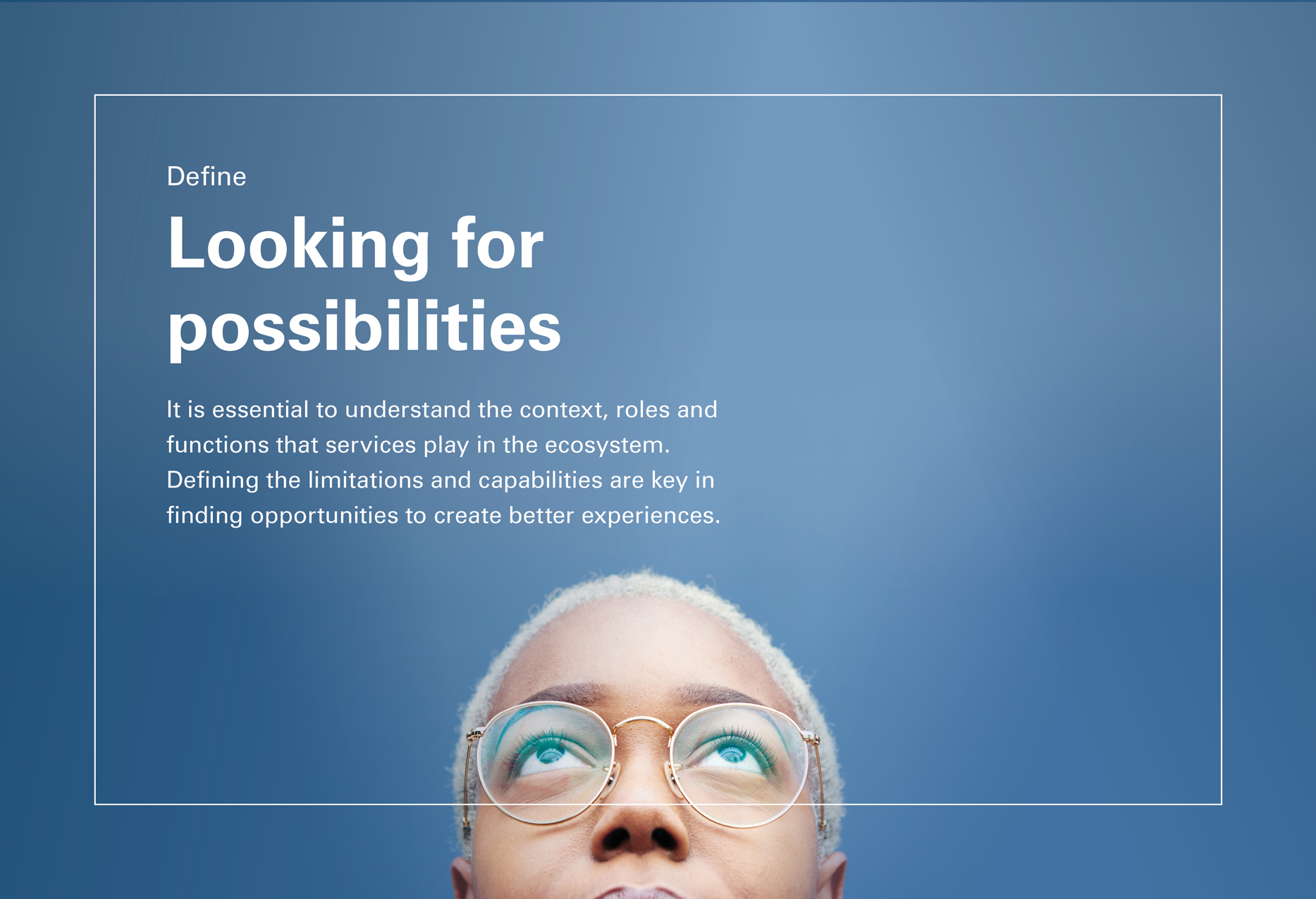
Define
Product, Design, and UX pulled into a core team – bringing engineering in early, before any direction was set. The output of the stakeholder workshop ran through a feasibility/impact filter: what was worth building, what wasn’t, what would require more than the project could bear. User personas emerged from the research. Story maps. Design principles anchored to member needs. Getting engineering in the room at this stage prevented the later work from drifting into the unbuildable.
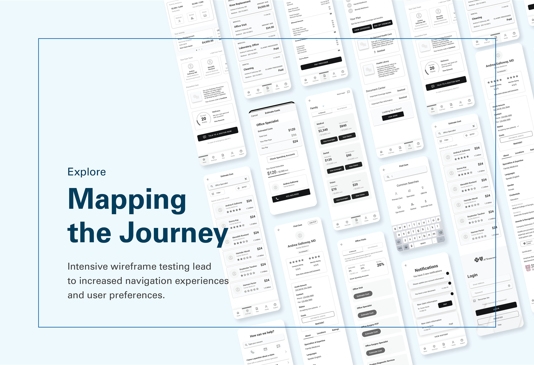
Ideate
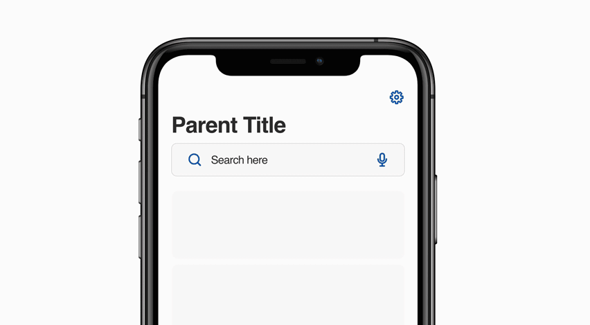
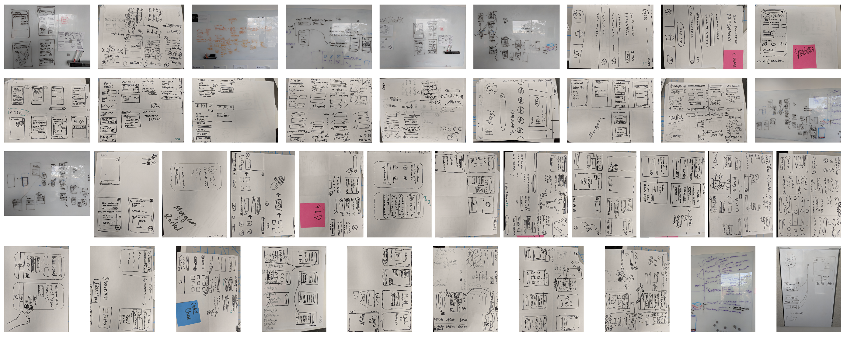
A design workshop, pairs sketching user flows for each story. Design synthesized the sketches into wireframes and low-fidelity prototypes – then worked with UX to pressure-test the information architecture through usability tests and card sorting. The rule: no design language until the bones were right.
Create
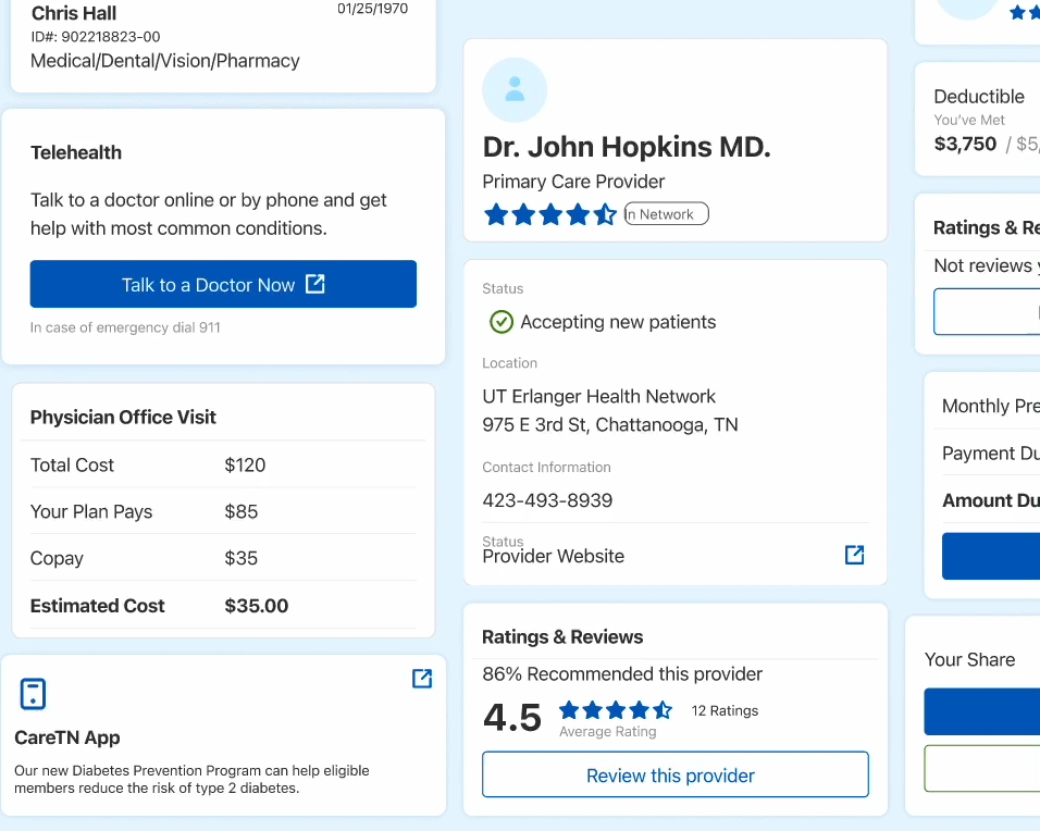
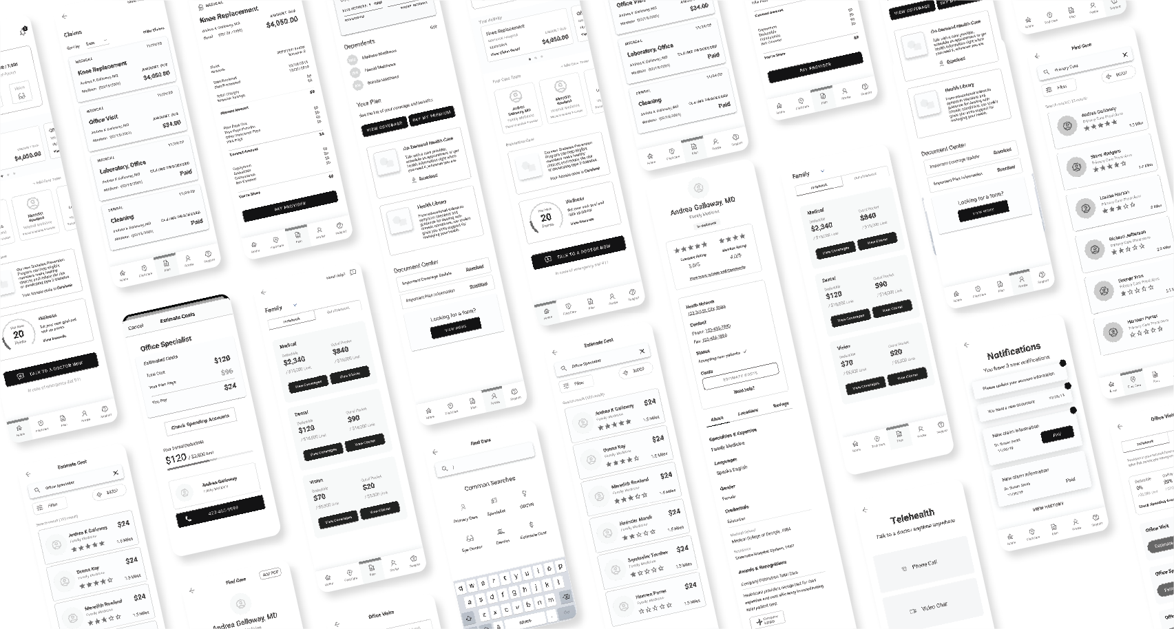
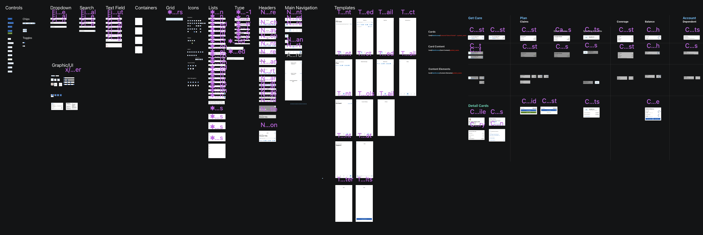
Once a stable mid-fidelity prototype held the experience together, the real work began. Every UI pattern broken down to its foundation using atomic methodology – documented, principled, tested for edge cases before it went anywhere near production. Not a style guide. A system intended to outlast the project.
Test
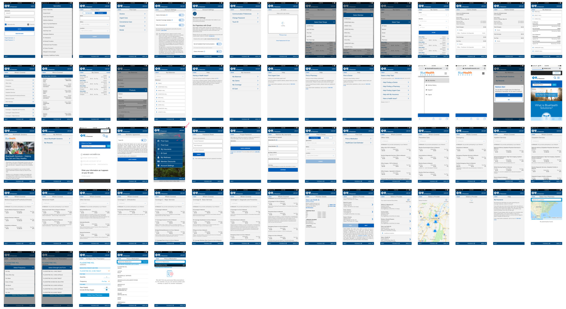
Two diverging visual directions, A/B tested. Not based on preference – based on what the research supported. Feedback converged into a single prototype. Stakeholder roundtables. The moment where months of work either holds up or doesn’t.
Develop
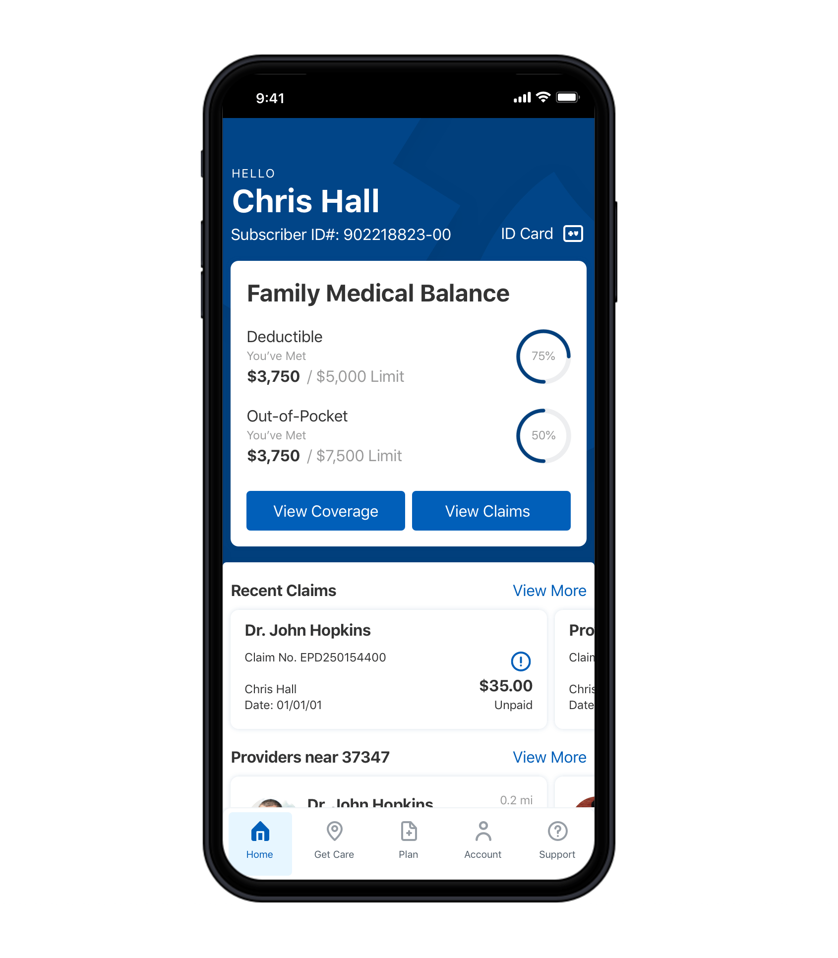
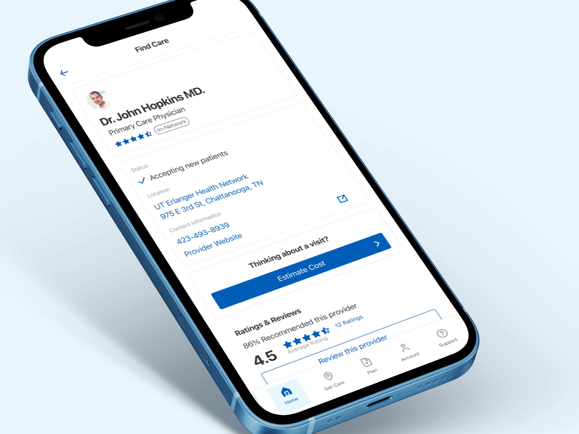
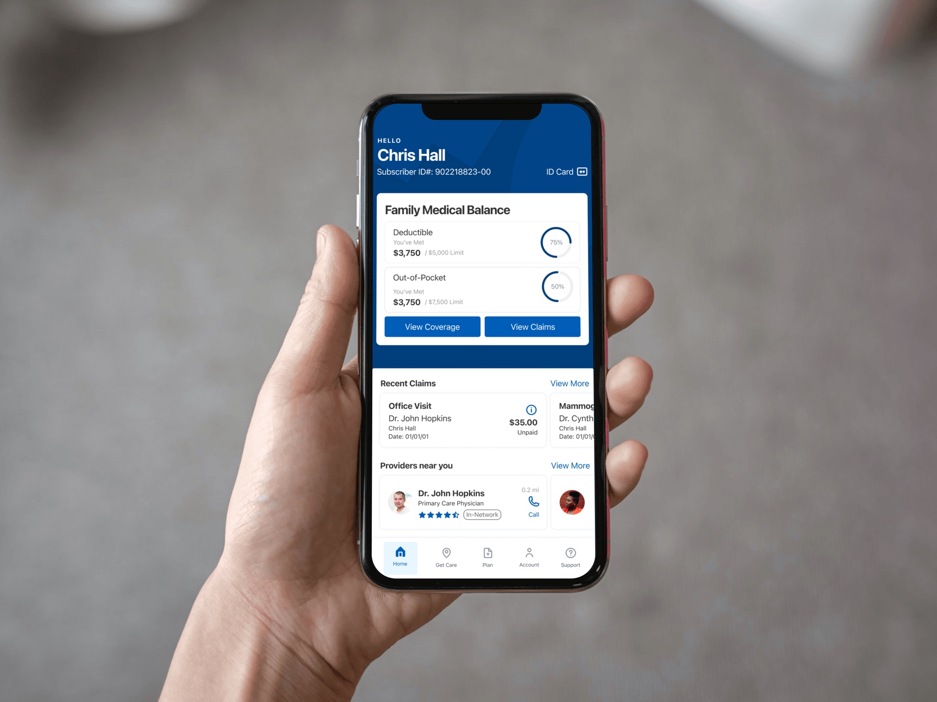
Development and design ran in parallel – micro-interactions, edge cases, error and success states fleshed out as engineering built. The design language grew into production. The app launched in 2021. Three industry awards followed. The system stayed in-house.