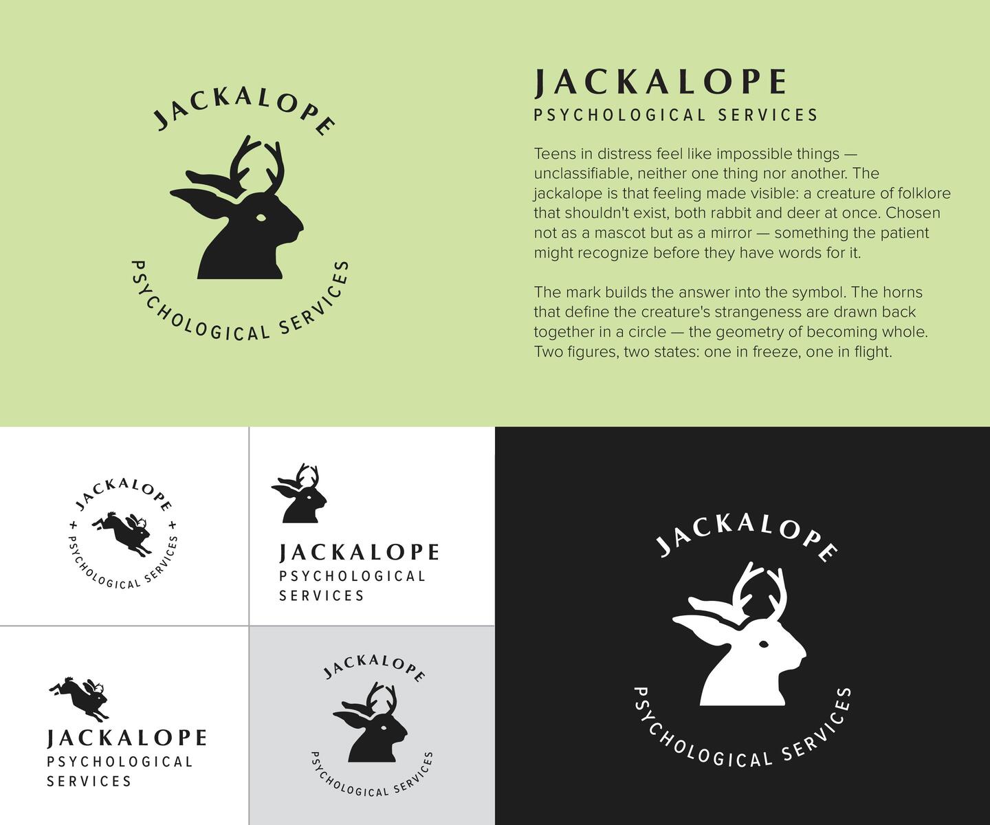
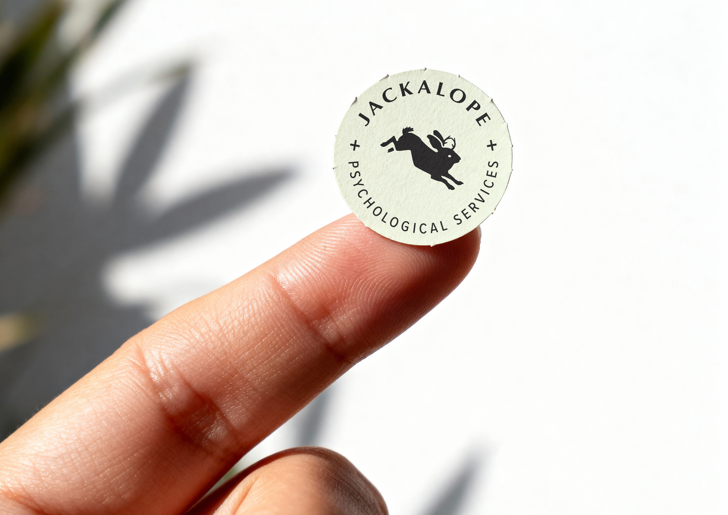
Brand identity for a clinical psychology practice serving teens and at-risk youth.
The jackalope – part rabbit, part myth – was chosen because it looks the way adolescent distress feels: strange, unclassifiable, neither one thing nor another. The mark holds both the problem and the promise: horns that split come back together in a circle, the geometry of becoming whole.
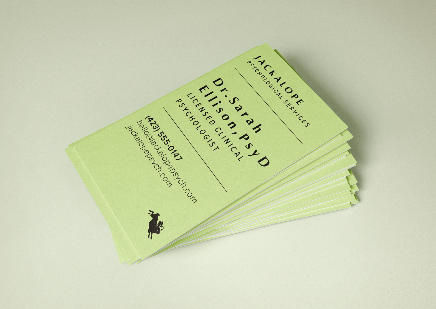
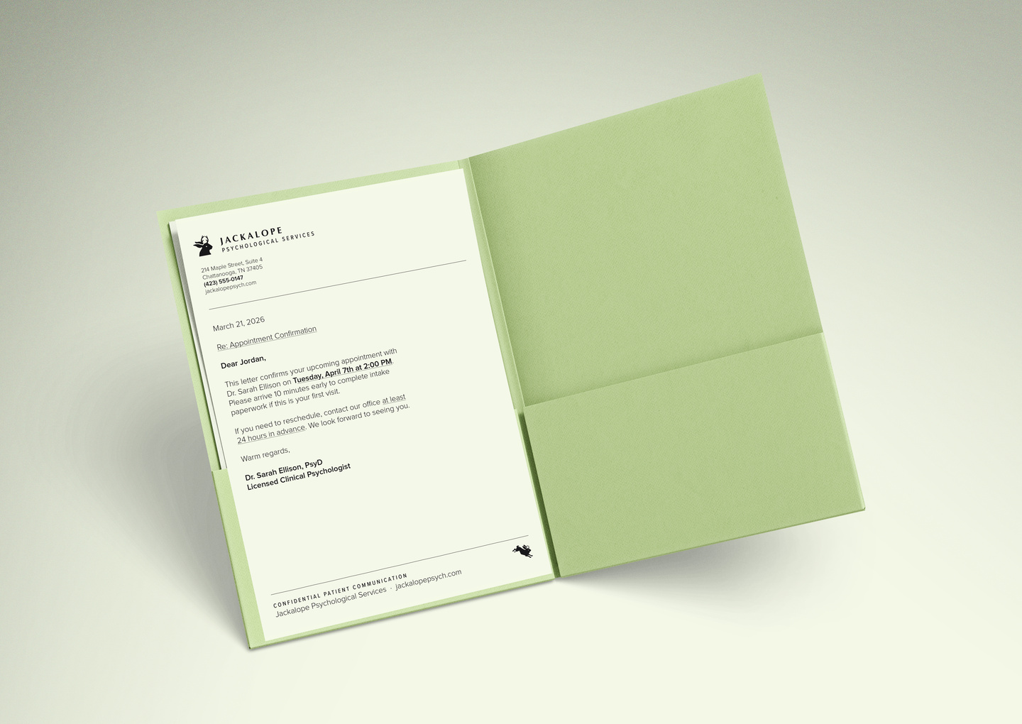
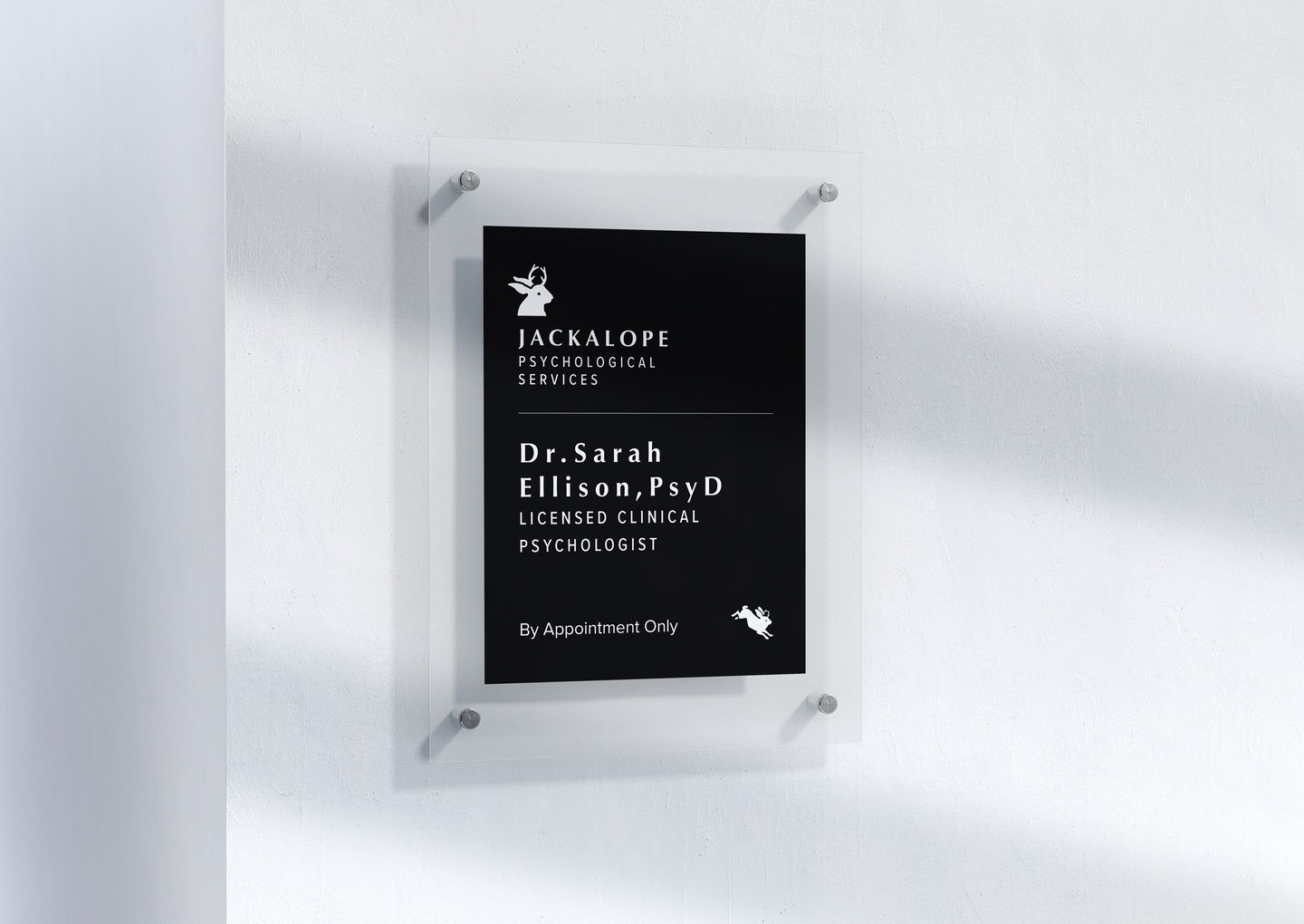
Problem Statement: A solo practitioner starting fresh. The brand needed to feel serious without feeling clinical – warm without being soft. The name already had mythology in it. The mark had to live up to that.
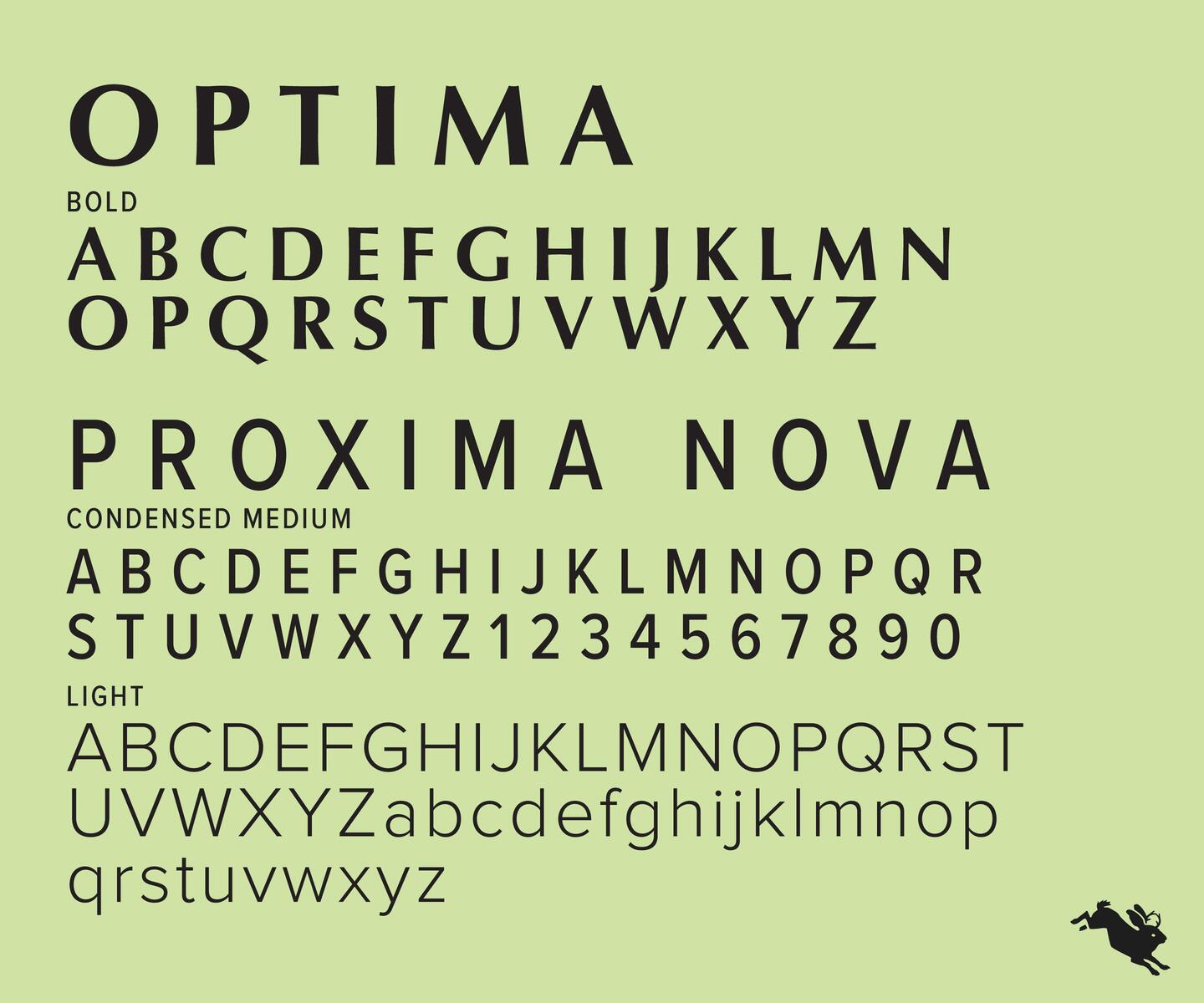
Successes: A two-state mark: freeze and flight. The same silhouette, the same circle – one still, one leaping.
Category: Brand
Client: Jackalope Psychological Services